Tuesday, November 4, 2014

Thursday, August 21, 2014
Birth of Venus and Propped
.jpg)
Birth of Venus, 1485
Oil on canvas
172.5 x 278.5cm
Links
1. About the painting and influences
2. Uffizi Museum info
3. Humanism and Neoplatonism

Propped, 1992
Oil on canvas
213.5 x 183cm
Links
1. Article 1
2. Independent newspaper article on Saville - Propped
3. Re-invention of the beautiful
4. "Branded"
Links
1. Article 1
2. Independent newspaper article on Saville - Propped
3. Re-invention of the beautiful
4. "Branded"
"Propped was the
last piece I did for my degree show. And the quote is from a French feminist
writer. I wanted the idea of a female body that is put on a pedestal to look
at, to observe and it is almost like a bird the way I have painted it with the
heel shoes and the connotation that brings in the language of women as birds or
chicks."
Jenny Saville
The French text carved in reverse, to imply the self scrutiny of looking into a mirror, translates,
“if we continue to speak in
this sameness, speak as men have spoken for centuries, we will fail each other
again”
By Feminist writer, Luce
Irigaray
"There was "immense
conviction" in making these pictures, she says, and an element of
self-loathing. "There is in everybody. We are taught to judge ourselves
from a very young age, to groom ourselves." And this creates a neurosis
for women, she says. "You see this dichotomy in women's magazines all the
time: an article on breast cancer - empowering; an article on skin products
that make you look younger - neurotic."
"More influential, more
enduring in her work, is the experience of sitting in on plastic surgery
operations. You realise something about the flesh, she says, when you see a
surgeon put his hand through a woman's breast. Or smell the burning of a facial
peel. You realise that the flesh is everything. "It's all things. Ugly,
beautiful, repulsive, compelling, anxious, neurotic, dead, alive." And it
is nothing. "Eventually we expel ourselves. We rust away. Our own body
rejects us. I don't find that tragic."
Thursday, October 31, 2013
Wednesday, August 28, 2013
Goya and Holzer

The Third of May, 1814
Oil on canvas
268 cm x 347 cm
1. website information 1
2. met museum
3. info site 3
4. Romanticism in Spain
 Jenny Holzer
Torso, 2007
10 double-sided, curved electronic LED signs with red and blue diodes on front and blue and white diodes on back Text: U.S. government documents
219.2 x 146.8 x 73.4 cm (86.3 x 57.8 x 28.9 in)
2. met museum
3. info site 3
4. Romanticism in Spain

Torso, 2007
10 double-sided, curved electronic LED signs with red and blue diodes on front and blue and white diodes on back Text: U.S. government documents
219.2 x 146.8 x 73.4 cm (86.3 x 57.8 x 28.9 in)
"Jenny Holzer’s words ask us to consider our thoughts and actions in the world. This essentially humanist and philosophical project encourages us to seek self enlightenment through examining our prejudices, false beliefs, fall back positions, and habits, to reach a new level of tolerance, understanding and self awareness"
- Juliana Engberg, ACCA’s Artistic Director.
- Juliana Engberg, ACCA’s Artistic Director.
Tuesday, August 27, 2013
Comparing Sandro Botticelli and Jenny Saville - The Nude
Birth of Venus, 1485
Oil on canvas
172.5 x 278.5cm
1. About the painting and influences
2. Uffizi Museum info
Propped, 1992
Oil on canvas
213.5 x 183cm
1. Article 1
2. Independent newspaper article on Saville - Propped
3. Re-invention of the beautiful
4. "Branded"
1. Article 1
2. Independent newspaper article on Saville - Propped
3. Re-invention of the beautiful
4. "Branded"
Tuesday, August 20, 2013
Comparing Russell Drysdale and Gerda Steiner & Joerg Lenzlinger: the environment
In order to research for your interpretation and comparison of Deserted Out-Station and The Water hole access the links below.

Russell Drysdale
http://www.abc.net.au/arts/drysdale/themes/essay1.htm
http://www.abc.net.au/arts/drysdale/paintings/24.htm - about Deserted Out-Station
http://www.hyperhistory.org/images/assets/pdf/drysdalepdf.PDF - access page 2 and 3 for CULTURAL INFORMATION
Gerda Steiner and Joerg Lenzlinger
 Education 1
Education 2
http://www.steinerlenzlinger.ch/stomachj_pipedreamsthewaterhole.html

Russell Drysdale
http://www.abc.net.au/arts/drysdale/themes/essay1.htm
http://www.abc.net.au/arts/drysdale/paintings/24.htm - about Deserted Out-Station
http://www.hyperhistory.org/images/assets/pdf/drysdalepdf.PDF - access page 2 and 3 for CULTURAL INFORMATION
Gerda Steiner and Joerg Lenzlinger

Education 2
http://www.steinerlenzlinger.ch/stomachj_pipedreamsthewaterhole.html
Thursday, August 15, 2013
Wild Horses
 |
| Glenn Brown, Wild Horses, 2007 |
via http://www.flagartfoundation.org/exhibition/67/description
This link gives you a really close look at Glenn Brown's swirling technique.
 |
| Jean Baptiste Greuze, Innocence, 1970 |
Wednesday, August 14, 2013
Appropriation and 'Fair Use'
The fair-use defense is built into copyright law to allow
creative people to build on others’ work without having to obtain
permission. This defense is complicated
because the court is required to consider four separate factors on a
case-by-case basis to decide whether a particular use is fair.
Despite the lack of clear instructions on how to compare
these factors, courts usually rely most on the first factor (“the purpose and
character of the use”) and the fourth factor (“the effect of the use upon the
potential market for or value of the copyright”).
The first and fourth factors, and some discussion of how
courts evaluate each one, are outlined below:
“The purpose and
character of the use.” Copyright law
specifically grants more leeway to nonprofit or educational uses, but even
commercial uses can be fair. One of the key questions that artists will usually
face is whether their work is transformative.
“Transformative” means more than simply taking another piece of work and
casting it in a new medium; it requires using it for a different purpose or to
view the original in a different light. Parody has often proven to be a
successful fair-use defense, and it requires a critique of the specific,
original work – use of the work as a more general satire receives less
protection under the fair-use test.
“The effect of the
use upon the potential market for or value of the copyrighted work.” One question that courts ask is whether the
consumer audience will substitute the new work for the original. If not, the
use may be fair. Another that courts
will ask is whether this sort of copying harms the original artist’s ability to
license the work. Bear in mind that
certain kinds of harm to the market for the original can still be fair, like
the reduction in sales that may result from a scathing criticism or parody.
Tuesday, August 13, 2013
Glenn Brown: Further research links
To prepare for the Glenn Brown Sac ensure you carefully read all the 4 handouts I have given you.
You must choose 2 artworks to discuss in your written report.
I advise you to use "The Loves of Shepherds". You must choose one other. Make sure you can find some commentaries that relate to the 2nd artwork you choose. Glenn Brown often works in series so many commentaries or ideas can be interlinked.
The Tate Gallery has a good online resource of Brown's paintings via this link.
Serpentine Gallery also has an informative resource about Glenn Brown's art via this link
Check out some of these other links as well.
Nerdist
Parkett Magazine article
Ludwig catalogue
Dark Star, 2003
You should also consider the copyright law in respect to appropriation
The Art Newspaper
Law on the Web
Appropriation in Contemporary Art
You must choose 2 artworks to discuss in your written report.
The Tate Gallery has a good online resource of Brown's paintings via this link.
Serpentine Gallery also has an informative resource about Glenn Brown's art via this link
 |
Van Dyck, Cornelis van der Geest, 1620
|
Check out some of these other links as well.
Nerdist
Parkett Magazine article
Ludwig catalogue
Dark Star, 2003
You should also consider the copyright law in respect to appropriation
The Art Newspaper
Law on the Web
Appropriation in Contemporary Art
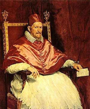 |
| Velazquez, Pope, 1650 |
 |
| Glenn Brown, Sex, 2003 |
 |
| Glenn Brown, Nausea, 2008 |
 |
| Frank Auerbach, Head of J.Y.M., 1 |
 |
| Glenn Brown, The Day the World Turned Auerbach, 1992 |
Tuesday, August 6, 2013
powerpoint for art movements research
This is the link to the Powerpoint to finish off your research.
https://docs.google.com/presentation/d/1BQmPQOAeWF0PvJEQDsa-gj8mZA5FO6elFTkuNWo1lxg/edit?usp=sharing
https://docs.google.com/presentation/d/1BQmPQOAeWF0PvJEQDsa-gj8mZA5FO6elFTkuNWo1lxg/edit?usp=sharing
Thursday, July 18, 2013
Unit 4 Art - Discussion and Debate
Carefully view and study the presentation via the link below.
This introduces the art issue on "art and originality" we will be discussing and debating over the next month.
It is important to read the commentaries of others to establish your own point of view.
You must explore a range of different opinions about the artist's work and the issue of originality in contemporary art. By referencing the opinions of others you will be asked to establish you own points of view.
For homework divide a page into 2 columns with 'for' and 'against' as the headings.
While reading and viewing the prezi presentation record notes of key differing viewpoints. Ensure you record the details of who wrote the commentaries and where and when they were published or sourced.
Click the LINK below to start your research
http://prezi.com/mjd3ymnuqk2z/?utm_campaign=share&utm_medium=copy&rc=ex0share
This introduces the art issue on "art and originality" we will be discussing and debating over the next month.
It is important to read the commentaries of others to establish your own point of view.
You must explore a range of different opinions about the artist's work and the issue of originality in contemporary art. By referencing the opinions of others you will be asked to establish you own points of view.
For homework divide a page into 2 columns with 'for' and 'against' as the headings.
While reading and viewing the prezi presentation record notes of key differing viewpoints. Ensure you record the details of who wrote the commentaries and where and when they were published or sourced.
Click the LINK below to start your research
http://prezi.com/mjd3ymnuqk2z/?utm_campaign=share&utm_medium=copy&rc=ex0share
Sunday, May 12, 2013
Monday YEAR 12 ART THEORY
Sorry I am unwell today.
Please use today's session to research Egon Schiele's and Del Kathryn Barton's work using the Cultural Framework.
Remember you need to provide evidence of your research. Keep a bibliography of the sites you use.
Links for research
Schiele
1. Essay about Egon Schiele's women
2. Fin de siecle Vienna cultural environment
3. About Turn of the Century Vienna
4. Interesting essay about Modernist youth culture
Barton
1. Art and Australia article on Del Kathryn Barton
2.Article from Art Collector Magazine
3. Interview from Dumbo Feather Magazine
Use this table to plan dot points of comparison and contrast for your SAC on the 27th May.
Please use today's session to research Egon Schiele's and Del Kathryn Barton's work using the Cultural Framework.
Remember you need to provide evidence of your research. Keep a bibliography of the sites you use.
Links for research
Schiele
1. Essay about Egon Schiele's women
2. Fin de siecle Vienna cultural environment
3. About Turn of the Century Vienna
4. Interesting essay about Modernist youth culture
Barton
1. Art and Australia article on Del Kathryn Barton
2.Article from Art Collector Magazine
3. Interview from Dumbo Feather Magazine
Use this table to plan dot points of comparison and contrast for your SAC on the 27th May.
Artwork TITLE:
DATE:
MEDIUM:
SIZE:
|
Cultural influences + issues raised in
the works?
Compare /contrast the impact of time, place, and events on
the selected artworks.
How does the time and place impact on the artists
approach to making art? Are they similar or different?
Can there be any comparisons or traces made between turn-of-the-century
Viennese Society and today’s culture?
|
Artwork TITLE:
DATE:
MEDIUM:
SIZE:
|
|
differences
|
Tuesday, March 26, 2013
YEAR 12 ART HOMEWORK
Homework tasks
EXAMPLE OF COMPARING THREE GIRLS AND PLEASE...DON'T...STOP USING THE FORMAL FRAMEWORK
- Complete the formal comparison task between Schiele and Barton. You began this in class. I will collect this at the beginning of Term 2.
- I will post an example on the middle weekend of the holidays if you would like to check you're on the right track. (updated 7th April SEE FURTHER BELOW ON THIS POST FOR MY EXAMPLE)
- Download and read through some of the info in the Egon Schiele book online. Familarise yourself with more of his artworks. Egon Schiele book online download
- View the 30 min artscape video on Del Kathryn Barton. Make notes of the commentaries for future reference.
EXAMPLE OF COMPARING THREE GIRLS AND PLEASE...DON'T...STOP USING THE FORMAL FRAMEWORK
Composition – Negative Space
‘Please...Don’t....Stop’ by Barton shares a similar
composition to Schiele’s ‘Three Girls’ in the way that they are both cropped to
create an enclosed, almost claustrophobic
sense of negative space. This framing device which cuts off the heads
and lower legs of the girls’ bodies propel a confronting gaze on their
sexuality as well as their intimate unity. The negative spaces that Barton has placed
between the bodies make them appear more fragile and isolated as opposed to
Schiele’s reclining models which merge as one intimate bundle of flesh and
fabric.
Line
Barton harnesses a similar graphic, ornamental, angular line
to Schiele which he learned from involvement with the Viennese Secession style.
However, while her sensitive spidery line scrawls over the girls contours in
jagged shimmers of detail, Schiele’s line is much more loose and free-flowing. As
a result Barton’s figures are infused with a rigid, manicured form and discomforting
posture whereas Schiele’s girls possess a relaxed, seductive grace.
Colour and texture
The use of complementary colour in the ‘Three Girls’ clothing
exudes a flamboyant, aggressive energy. The way they have been painted with
rough swirling brushstrokes create dynamic movement and implied texture to
further enhance this expressive quality of aliveness, rawness. The skin is
blemished with vigorous, imperfect flourishes of warm reds and sickly ochres, a
characteristic that upon first glance seems
to separate the two artists, as Barton’s skin is porcelain white which is
contrasted against elaborately decorated patterns. Although, on closer
inspection Barton has tarnished her girls with subtly flushed checks that at
once appear like smeared make-up and subtle bruises of the flesh. In contrast
to the vibrant complementary clashes of colour in the ‘Three Girls’, the
dominant colour in Barton’s painting is a suffocating monochromatic pink which creates
a mood of delicacy and youthful femininity.
Style
Both artists utilise an expressive angular linear style of
depicting the human form to emphasise the bony structure beneath the flesh.
Schiele’s girls’ knees and elbows are nobly and awkward as are the protruding
rib cages and elongated limbs of Barton’s adolescents.
Other formal qualities of note that could be discussed
·
Emphasis – Barton emphasises the eyes and
enlarges the heads – why? Schiele elongates the limbs....
·
Techniques – Barton’s use of wet media is
significant– (watercolour, ink, gouache) Gives the appearance of the bodies a
wet, glistening quality. Translucent, ghostly, full of feeling – wetness associated
with pain or emotion. Schiele’s technique is rougher, brushstrokes are direct
and expressive, mottled....
Tuesday, March 12, 2013
Monday, March 11, 2013
Wednesday, March 6, 2013
Tuesday, October 30, 2012
Tuesday, February 21, 2012
documents for year 12 theory
SAC Task
The 4 Analytical Frameworks
The Contemporary Framework information
Comparison Table of "Garden of Earthly Delights" and "Protein Lattice"
BOSCH
Bosch (some info)
The Complete Paintings - Bosch (TASCHEN TEXT ONLINE)
A more in-depth overview of Bosch
Interpretation of "The garden of earthly delights" (contribute your ideas in dot points)
PICCININI
The artistic experiments of Patricia Piccinini
Challenging modern life, opinions and emotions with art
EVOLUTION exhibition resource
PICCININI at South Australia Art Gallery
The 4 Analytical Frameworks
The Contemporary Framework information
Comparison Table of "Garden of Earthly Delights" and "Protein Lattice"
BOSCH
Bosch (some info)
The Complete Paintings - Bosch (TASCHEN TEXT ONLINE)
A more in-depth overview of Bosch
Interpretation of "The garden of earthly delights" (contribute your ideas in dot points)
PICCININI
The artistic experiments of Patricia Piccinini
Challenging modern life, opinions and emotions with art
EVOLUTION exhibition resource
PICCININI at South Australia Art Gallery
Jean Michel Basquiat (born 1960 - died 1988)
Use the links below for your research on Basquiat:
Good Luck!
Go to the essay section to read info on 5 of Basquiat's paintings.
This website is fun and interactive and has info on 6 paintings
You can watch "The Radiant Child" documentary on Basquiat. It's on youtube in 7 parts. It has lots of great real footage of him.
Monday, February 20, 2012
Hieronymus Bosch (born 1450 approx - died 1516, Dutch)
Formal Interpretation (pay close attention to creative descriptive language and art terms)
elements / principles / materials / techniques /style / symbols
elements / principles / materials / techniques /style / symbols
- The Garden of Earthly delights was painted with oil on wood panels in the form of a triptych between 1490-1510.
- Unsettling inversions of SCALE dominate the center and right panels. What meaning does this create?
- Bosch's style was said to be influenced by the RENAISSANCE in the way he paid such careful attention to detail and the realistic portrayal of the world around him. eg. His beastly, devil-like creatures are constructed from close observation of parts of real animals. He has been recognised as a fore-runner to the 20th century movement of SURREALISM.
- Bosch arranges objects and figures vertically to imply some depth to the scene. They reduce in scale to give the feeling of them receding into the distance.
- Bosch's application of oil paint was revolutionary for his time. He applied rough layers of paint in a style that came to be called IMPASTO.
- The composition of the central panel is symmetrically balanced. The complementary colours of red and green dominate this panel and draw emphasis to the red fruit as an important symbol of meaning.
- The bright colours and repetitious detail of carefully painted flesh provide a beautiful feast for the eyes. Bosch employs repeated tiny dot shapes to also create pattern evoking 'a luscious jewel-like surface'.
Subscribe to:
Posts (Atom)